As part of artwork day we got some of DiS' favourites to contribute some words on their favourite record sleeves. Keeps 'em out of trouble, doesn't it? They were only too happy to help, their selections are below, and run the gamut from psychedelia to soul to performance art. Going by the age of the records, it either says something about the death of good artwork by the rise of 50 pixel squares on an iPod screen, or something about album artwork having less of an impact on our psyches once we're no longer in our formative years. There's nothing more important than the posters that grace the walls of our teenage bedrooms. Either way, below are the choices of bands including Liars, Slow Club, of Montreal and Wild Beasts. Look:
Charles, Slow Club
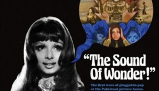
Various The Sound of Wonder (Finders Keepers compilation)
Listening to the album has become an event in my house. It features a load of late 60's and early 70's Pakistani pop. The artwork is a combination of collage and original artwork from EMI Pakistan. Feels nice to the touch too!!
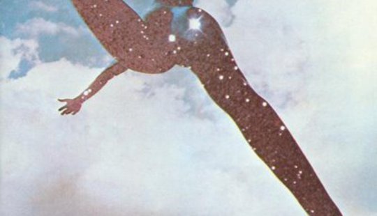
Free Free
I have no personal connection to this album at all. I haven't even listened to it, I just like the front cover.
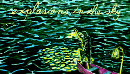
Explosions In The Sky - All Of A Sudden I Miss Everyone
I like the painting.
---
Kevin Barnes, of Montreal
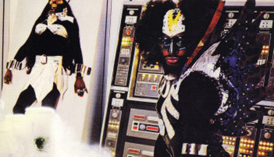
Parliament The Clones Of Dr Funkenstein
I always keep this album in eye shot at my studio. I find it strangely inspiring. There is obviously something happening here but it's hard to tell exactly what. Presumably, Dr Funkenstein is in the process of creating some clones, as is his want to do. Two things are for certain, Dr Funkenstein's clones have marvellously large booties and he's got some kickin' electronics in his lab. I don't know exactly what role his weird bird man assistant is playing, but I imagine it is something not too wholesome. The clone in the bra is especially terrifying, in the best possible way. The cover art encourages me to take chances creatively and it also reminds me that there is nothing wrong with being a freak.
---
Hayden Thorpe, Wild Beasts
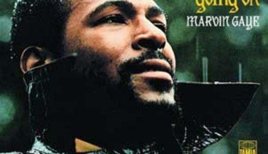
Marvin Gaye What's Going On?
My most loved album artwork is Marvin Gaye's Whats Going On? It isn't really very visually striking or beautiful in anyway, in fact it's almost anti-artwork. To the untrained eye it seems to be just a photograph of Marvin standing in some back yard under a grey sky. What appeals to me so much is the back story and subtle detail behind it. We must remember that Marvin Gaye was the Usher of his day, Motown's pop darling, head of a new generation of Afro-American heartthrobs. You wouldn't see an un-glamourised picture of Usher wearing a trench coat in the pissing rain would you? Marvin was deconstructing his own myth, he was stripping away all the bravado, much to Motown's dismay (they refused to release the single What's Going On? initially). Marvin's brother had recently returned from Vietnam and passed onto Marvin his tales of dismay and confusion over why so many young Afro-American men were loosing their lives fighting a pointless war for a country that had given them so little. Their form of peaceful protest was to let their fros and beards grow, an up yours to the White middle class, clean shaven face and side parting. Hence Marvin's beard. The beard also had religious overtones, Marvin had recently "found God", insisting the songs were sent to him from above. His beard represents a wiser, more spiritual man. You can see it in his defiant expression, having battled with Motown to get the record released with all it's political and religious overtones, he is a man who had stuck to his guns and won. Bizarrely, cocaine addiction and 'Sexual Healing' would soon follow.
---
Alexei, Johnny Foreigner
I spent a whole day schizoid trying to decide this. It was like arguing with myself age 25 and 15. 15 yr old me is the worst, he kept interrupting waving a 12" cover of Dookie going LOOK AT ALL THESE LITTLE GUYS!! At one point he even said Iron Maiden, cos they have a consistent monster icon and list every guitar string and groupie they broke in the liner notes. None of me have ever liked Iron Maiden.
Anyway, at a point where my teenage self got distracted by the chords in the Parklife booklet, and how awesomely frantic Blur's life must be to end up making the artwork from whatever stationary was closest, 25 year old me made some pretentious point about how easy it is to divorce the art from the music its supposed to be bound by, he sights Sings Reign Rebuilder by Set Fire to Flames; the awesome booklet that came packaged inside took up way more of our attention than the two discs inside ever did.
Maybe we just prefer looking at collages of urban decay more than hearing its clunky fragments, but isn't this cheating? and if so, does it discount Ikara Colt's awesome sticker album concept, or that weird CD album my friend Seb has that turns into a house?
Maybe Read Music/Speak Spanish is the best compromise. First used by OK Computer, the tracing paper overlay isn't cheating and works in gimmick context cos it's like a town planning projection overlay SEE? Spiteful teenage me is happy with that cos he always had a sci-fi b-movie soft spot for The Bends' future-o-vision style.
I'm not so sure, it's clever but hardly beautiful like Logic Will Break Your Heart and its animated live show projection wonders, or Beat Dyslexia's luscious digital ships vs ghosts vs dinosaurs collage, or Hug the Coast's cartoon lighthouse blues.
25 yr old me is starting to think no amount of post rock pylons or anti-commercialisation sentiment or painstaking set pieces can beat an out of focus photograph of a house in the evening for loaded emotional resonance, hello American Football and And Then Nothing Turned Itself Inside Out.
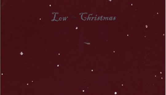
So whilst teenage me is either immersed in the booklet of Mellon Collie or pretending he understands all the borrowed quotes in The Holy Bible, and the 25 yr old me is out taking pictures of his own house, I declare the best album art ever to be Low's Christmas album. Sort of like a miniaturised Constellation-style card pack, line drawn, elegant and stark and forlorn yet still warming to behold, and perfectly representative of the songs inside.
---
Yoni Wolf, WHY?
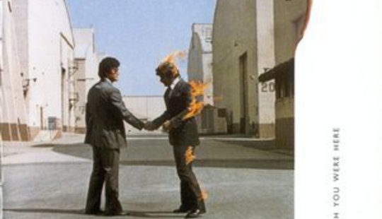
Pink Floyd Wish You Were Here
This is such an obvious choice, I know! It's an iconic image that I feel sort of lame for saying is my favourite, but I must be honest. There's a reason why it became so iconic. I like how simple it is; that it's an (presumably) unaltered photograph that would be utterly uninteresting if not for the fact that the man on the right is on fire. I was going to choose this album cover I found at Amoeba in Berkeley flipping through vinyl about a year ago. It was a record by Thee Oh Sees!... but I can't seem to find it on the net to find out the title. It was a very shitty pencil drawing of a limousine that was so long it spiralled into itself for eternity like a nautilus; like an expanding universe of infinite status.
---
Jeff Lewis
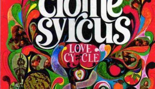
The Crome Syrcus Love Cycle
One of my all-time favourite album covers is for the album Love Cycle by the 60s band The Crome Syrcus, it's beautiful, colourful, a nice combination of being both very hand-made looking but also very cosmic/psychedelic. I don't think anybody would pick this as their favourite album (despite a couple of stand-out tracks) but for album art it's hard to beat - and it's also hard to justify owning on anything other than big, beautiful vinyl! Why would you even look at this on CD or on a computer screen? The original record also has a very thick and heavy-coated cardboard sleeve, so it's a real piece of art to behold, the texture of the cover definitely adds to the experience of it.
---
Blood Red Shoes
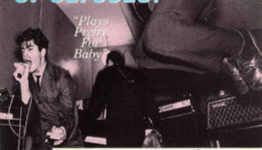
The Nation of Ulysses Plays Pretty For Baby
Steven Ansell's choice: It's a totally modernist sleeve, weaving 50's Americana, Soviet propaganda, fake CIA-style reports and rock 'n' roll rebellion together into something which perfectly represents the musical aesthetic and the references made in the lyrics. It's not perhaps that iconic or striking as a stand-alone sleeve but I love it because it's such a good fit.
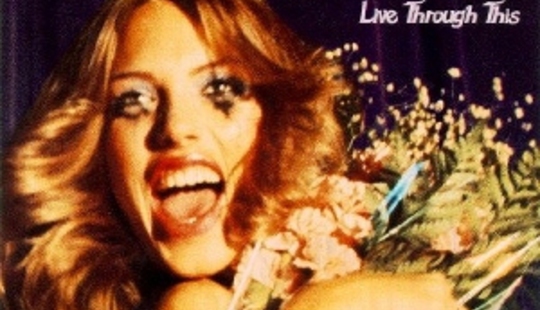
Hole Live Through This
Laura Mary's choice: This is probably my fave cover of all time. Even tho visually its not the kinda style I like I think it perfectly sets the scene for the record. Its one of those that I think ''I wish I had thought of that''. When I was younger I prob listened to this album everyday it meant so much to me I guess the image will always be instilled in my brain. I love how her mascara is just running down her face. perfect.
---
Sky Larkin

Fucked Up Chemistry of Common Life
Katie's choice: I bought this record without out hearing any of their music, partly because I'd heard they were great and partly because of the cover. The image is of Manhattan Henge, a semi-annual event where the setting sun aligns with the street grid in Manhattan. For me the image and the title are a perfect fit though I can't quite put my finger on why, maybe it's because the way that the sun floods the street scene is illuminating and dominating at the same time.
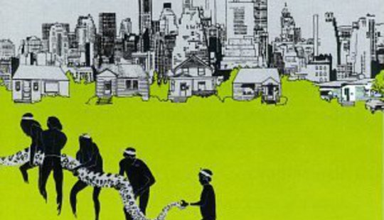
Joni Mitchell The Hissing of Summer Lawns
Katie's choice: I love pretty much anything that is simultaneously suburban and sinister, the title of this record suggests sprinklers but the cover suggests giant snake (which continues onto the other side of the booklet).
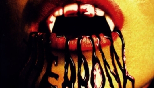
The Bronx The Bronx I
This record cover will be burned into my brain for as long as I listen to the record itself, as it perfectly declares The Bronx’s ethos. It's schlocky, soft-focus/soft-porn aesthetic reflects the tongue-in-cheek attitude of the band themselves, who always endeavour to add a bit of swagger to anything they say and/or do. The fantasy/horror imagery serves as a taunting homage to bands caught up in scene rules of imagery and sound; The Bronx took it and injected it with vibrancy and humour (and a little bit of sex for good measure) that I think shows both in the artwork and in the music.
---
Zac Pennington, Parenthetical Girls
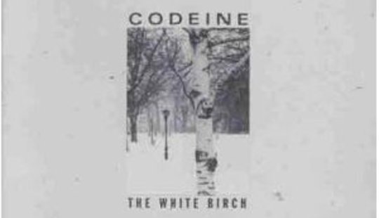
Codeine The White Birch
When I was a teenager, a promotional poster for this record covered a rather prime piece of real estate on my bedroom wall — one that stretched the cover image’s dimensions is such a way that it changed the whole tone of the composition. I prefer the square version. I realize that this is a plainly dated design by today’s standards, similar to the weird velum liner notes that seemed to me so novel at the time, but it still perfectly encapsulates the music on this record — harkening back to the then-dated Factory design of Peter Saville.

Patti Smith Easter
Is this a good record cover? I don’t really know. What I do know is that seeing Robert Mapplethorpe’s cover image of a sheer-slipped and dishevelled Patti Smith for the first formative time left me scarred with a lifelong propensity for feminine body hair. I can’t decide if this would’ve greatly delighted or disappointed Bobby.
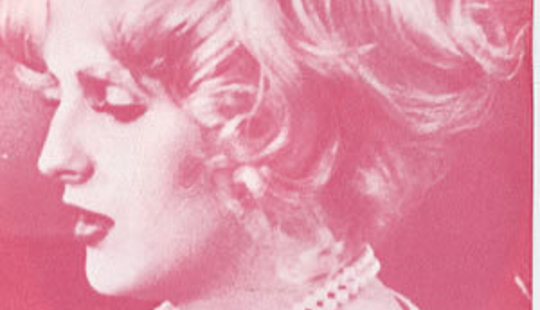
The Smiths Sheila Take a Bow (Candy Darling version)
My inclination toward the Smiths’ iconic album design is a little bit chicken and egg, but that’s part of its charm. I’ve always loved that so much of Morrissey’s self-mythology works on pure plagiarism — an attempt to posit himself unapologetically amongst his teen idols by simply making them monochrome, and then slapping his band name over the top of them. Endorsement by proxy. This one in particular has always resonated — Candy looking lovely — and serves as a good counterpoint to the cancer-ridden Candy that covers those Antony records.
---
POSTSCRIPT Due to a miscommunication, Angus from Liars picked his favourite piece of artwork. Despite that, it's interesting, so it's going in this article. So there.
Angus Andrew, Liars
Seedbed performance piece by Vito Acconci (January 15–29, 1971) - watch here
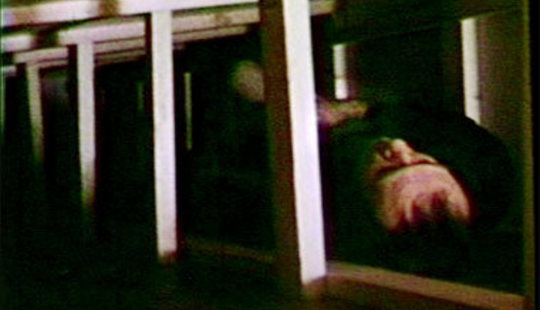
I get weirded out by art galleries. Sometimes they feel like showrooms for commodities. Bright, silent, stark and intimidating. The artwork that interests me attempts to subvert those spaces. To question the role of the gallery as the location and determiner of art by transgressing the traditional boundaries between artist, audience and art market.
In 1972 at the Sonnabend Gallery in NY Vito Acconci built a wooden floor raised 2ft up one side of the room like a ramp. Viewers were encouraged to walk on the ramp as Acconci lay hidden beneath – masturbating. He did this 3 days a week, eight hours a day, using a microphone and loudspeaker to vocalize his fantasies about the people walking above.
The documentation of Seedbed was presented as a series of 3 photos: a visitor walking across the ramp, a visitor sitting on the ramp next to the speaker and Acconci beneath the ramp.
These photos were accompanied by text:
“Halfway across the empty room, the floor ramps up to the far wall, viewers walk across the floor and up the ramp. Under the ramp, I'm lying down, I'm crawling under the floor over which viewers are walking, I hear their footsteps on top of me. I'm building up sexual fantasies on their footsteps, I'm masturbating from morning to night. My voice comes up from under the floor. "You're pushing your cunt down on my mouth..you're pressing your tits down on my cock.. your ramming your cock down onto my ass." [Now and then, you hear me come: I've done this for you, I've done this for you, I've done this for you.]')
"In Seedbed I had the floor ramped, I entered the ramp and lived underneath it during gallery hours. It was important that I get under the ramp before anyone arrived and was there after everyone left. I became the floor. People would come in and I would talk to them, I would conjure sexual fantasies from their footsteps and constantly masturbate, it was about the inside coming outside. At first I thought of spitting constantly, or inserting a small video camera which would record my eating some kind of food which would grow a little tapeworm inside, but this was too baroque, too complicated. So I settled on masturbation. Scattering seed...."


