Caspar Newbolt is President and Art Director of Version Industries, Inc. based in DUMBO in New York city.
"Two nights ago I was on the subway in New York, making my way back from my old friend (and Version Industries co-founder) Giles’s apartment. I had headphones on and was physically moving to a beat in my seat on the train. A girl walked over and gestured for me to remove my headphones. In doing so she asked me what I was listening to, as she’d noticed that I was clearly really into it. Tiger Girl I said, by 65daysofstatic. She smiled and asked me if she could take a picture of me for her blog. She then handed me her card. Turns out she writes about people on the subway and what they’re listening to.
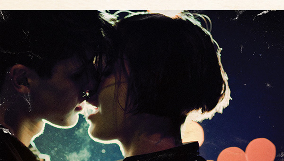
We Were Exploding Anyway, the title of the new 65daysofstatic record, sums up more than just the image on the cover. It sums up more than the dancing noises emanating from within the sleeve. It describes a fair few things in fact, most of which are best left up to the imagination of the band’s fans and critics. For me however it describes the culmination of a long-term friendship and collaboration that started four years ago when I heard 65’s cut, 'Radio Protector'.
Listening to that track for the first time, I had the overwhelming feeling that I was hearing a band who’d written their first classic song. Classic in the way that some Smashing Pumpkins songs can feel. More importantly though, I’d found a band that could make us better at what we do. A band who somehow, without us realizing just how yet, were speaking our language.
The graphic designer David Carson once said in an interview that he couldn’t do good work without music playing. He said that when he gets a new design project to work on, he heads to the record store and buys 5 or 6 new albums. I realize now that we’ve taken that one further. We contact the bands we’re utterly obsessed with and tell them they can have everything we’ve got to offer, for nothing, if we can just be responsible for their artwork. You see we’ve found that there’s a unique power to be harnessed when you know the music is unquestionably tied in every way to the work it drives you to produce. In other words, we find it really hard to do good work unless we’re deeply moved by the subject matter, and 65daysofstatic had gotten to us. Yeah, we’d got it bad.
Over the course of the first few months of talking via email with 65 it became apparent that we’d all seen the same films, read the same books, enjoyed the same music and all for exactly the same reasons. In fact it soon became very apparent that I was, by way of relating to some abstract quality in their music, getting to know people that knew the way my mind worked better than many of the people I’d grown up with. This was exciting because it meant that there was an immediate level of trust between us. An ability to finish each others sentences, creatively speaking. So connected and in tune was the hive mind.

...
So where were we? Right - this friendship. The reason we were all exploding anyway.
My company, Version Industries, is the same age as 65daysofstatic. It has the same number of members. Everything 65 have done and everything we’ve done has somehow lead to this exact point in time. This record’s music and artwork is, to date, the most confident, open-hearted and streamlined realization of what we as entities have hoped to create. It could not have happened without the years of collaboration, the knocking of ideas back and forth over the Atlantic Ocean endlessly, effortlessly and often hopelessly. The hopelessness in particular leading to this need to explode. You can’t imagine (or maybe you can), what it feels like to watch films, listen to records and read books and have that burning sensation inside you to want to make something as good. Maybe not even better, but simply as good. Then to have that chance taken away from you simply because you aren’t good enough yet, or because for whatever reason the opportunity didn’t arise, or because at the last moment the people you were working with decided to change it, and consequently killed it.
We Were Exploding Anyway is to us about a group of friends finally realizing the power of collaboration and, like a baby in a microwave, exploding so hard and so fast that we cover every inch of the inside. Except by microwave, I mean package design. And by baby I mean a great album.
...
What had started with long avid discussions online and on tour buses about John Carpenter, Jeff Noon, Larry Clark, Daft Punk, Gregory Crewdson, Watership Down, Factory Records, Alternative Reality Games, Cormac McCarthy, Saul Williams, Trent Reznor, Refused, Coffee, Clint Mansell and House Of Leaves, culminated in an artwork brief from the band late last year that included little more than a poem by Dylan Thomas, 2 old photographs, the name Gregory Crewdson and a good feeling about the word brinkmanship.
After everything is understood, very little needs to be said.
I had recently become good friends with another character who was about to explode. Sensing this I called on him to help me realize this project in a way that I knew that only he could. His name is Matt Sundin and after sitting on the roof of his apartment, talking late into the night about films and how we might one day make them together, I knew I’d found our photographer. Already fan of 65 himself, he immediately called upon every resource he had and soon we were casting for the girl and boy characters from hundreds of kids in a Brooklyn studio.
...
Girl and boy? Well, the idea we’d gone with was simple. We bring to life the girl and boy embraced in a kiss that you see in the band’s long-standing logo. A gesture that reflects the band’s feeling that this new album is the culmination of everything they’ve been trying so hard to achieve up to this point. If everything before now was a sketch, a draft, a trial run and a rehearsal - this album was the real thing, the opening night, the space mission. Our Bladerunner motion picture, to your Syd Mead painting.
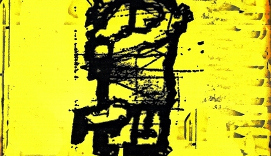
This affectionately titled Girl / Boy logo of old is the kind of rough doodle you find on a kid’s folder or bag at school. A scruffy marking that rather aptly reminds me of Aphex Twin’s Girl/Boy Song and something I’ve stared at for good periods of time myself. It’s not often you find a logo so abstract and offering to so many interpretations as to tone, mood and narrative, as this. But then it’s not often you find a band like 65 either.
...
At this point the majority of the record had been written and recorded, but was in various stages of being mixed and mastered. The final tracklisting was also very close, as were some of the song titles. Therefore both Matt and I had a very clear idea of the final sound and the emotional gestures the album was making. This helped communication between us in the build up to the shoot day a great deal and of course meant the music was still ringing in our ears as we hit the freezing streets of Brooklyn last January, to capture our scenes.
Before I continue though, there’s a story I should relate in order to underline my (probably misguided) belief that an album without a cover is half complete and that anyone who obtains a record without the artwork and listens to it out of the context of those visuals, simply isn’t hearing that album yet.
As a young kid I used to get so violently affected by album artwork that I often couldn’t listen to certain records at all. I had been told Aphex Twin’s Richard D. James Album was great, but the many cut up bits of ear all over the back cover and the evil grinning face on the front simply terrified me. Likewise Pearl Jam’s Vs., whilst again I soon learnt it was a great piece of work, that sheep with his mouth caught in the fence on the cover was simply more than I could handle as a kid. In both cases it made listening to the music a super intense and semi-fearful experience. Furthermore, if a record had a red cover, the music I heard was red in terms of the imagery it created in my head. Likewise, a yellow cover? Like Kingmakers’ Sleepwalking?
Yellow music.
So maybe I’m a little autistic in this regard, but that’s how important a good sleeve is to me and why I’ve spent so long pushing my company into a position to make them for bands. I knew I had a passion for listening to records, but I also felt it my mission to make sure that bands were getting the correct visual representation. Like a defense lawyer on a rape case.
In short - making this sleeve was no fickle matter. It was an unrelenting quest to match picture to sound. Whether we succeeded or not is up to you to decide, but don’t think for a second that we didn’t shed blood at one point or another in trying.
...
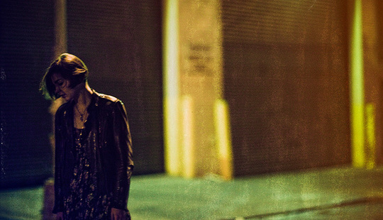
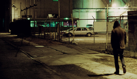
The basic thinking for the shoot was that we were trying to capture images that felt like film stills. We wanted a cover that felt like an intense moment in an old classic ‘coming of age’ movie that you’d not managed to see yet. This went right down to the beat-up feeling that we gave to the final printed artwork - as fans of films from the 80s with that ‘dirt under the fingernails’ feeling that’s so missing in today’s cinema, we all wanted to hark back to that. We wanted to give things a sense of overt realism and suggest that this was a record sleeve that you might have dug out of your parents boxes in the attic. A bit bent, slightly damp, but the cover nostalgic and enticing, and the music still sounding warm and good.
To get us in the right mindset leading up to the shoot we were looking at film stills and trailers, rather than photographs. In the casting I was very keen to find a kid like Casper from the movie Kids and a girl like Léa Seydoux in the movie La Belle Personne; the trailer for which I must have watched 100 times. Track it down and you’ll understand why.
Enter the Canon 5D Mark II camera. For those not savvy to this magical machine, it is not just one of the most stunning digital still cameras, but it shoots gorgeous 1920 x 1080 pixel HD video. Armed with two of these on the shoot we were able to not just photograph, but also film our characters in the midst of their conflict and appeasement.
In terms of performance, we were very keen to get a sense of pathos between the characters. I wanted the feeling that there’d been some unrest and this was them making up. This was the moment where, even if their relationship never really worked in the end, nothing else mattered. A split second wherein it was all about that eruption of energy, passion, need, reconciliation and trust. These of course were all feelings I was getting from the band and their new record at the time.
We had them fight, push each other around, grapple, get angry - at one point Emily, the girl, was even in tears. It was the moment when we realized we were, one way or another, going to have something magical to commit to the cover. I’m not sure Tommy, our boy, knew what had hit him. It can’t be often that photo-shoots get as psychological as this. When you’re asked to fight with and then make-out with a girl repeatedly all day in front of a shivering but endlessly patient crew you must have mixed feelings of luck and embarrassment. I’m sure I wasn’t the only one that started to think I was in the wrong line of work, as I stood there with teeth chattering furiously in the darkness off set watching these two entwined in each other’s warmth, for the umpteenth time. But everyone was extremely professional, doing nothing but the finest job they could and I came away with an enormous sense of that, like 65, I was now one step closer to making the kind of things I’ve secretly always wanted to make.
The next morning, back in my studio, Matt got in touch. He was already sorting through the images eagerly and pretty soon I was looking at mockups of the cover.
There really are no words for the moment when you see the covers in your email and know that no matter what, the job is a success. I literally was shaking in my chair, unable to focus on any of the other tasks I had that day. I had the new album on repeat, loud and in my ears, and just sat there smiling at the artwork in its final resting place.
Mission accomplished.
Despite giving them something like 9 covers to choose from the band were unanimous in their decision to go with the cover you see now. It was, as Joe (guitar player in 65) put it, ‘a beautiful expression of human love’. The back cover was decided upon soon after - it was of course our big nod to the photographer Gregory Crewdson.
From there we worked with the label on the package design and I produced three entirely different booklet designs for the CD inlay. In the end we went with what was a mixture of all three, with certain ideas lifted from the booklets of Nine Inch Nails: The Fragile and Aphex Twin: Selected Ambient Works 2. The vinyl design was a direct extension of this but with some small differences - in particular the vinyl includes a logo design idea that didn’t seem to fit anywhere else.
At this point I have to mention Chris, Scott and Ian - the guys over at Hassle Records and Modo - without whom making the fancy artwork packaging simply would have been impossible. Not just because they always try and make great record sleeves, but also because of their trust and patience. As great as you think you are at making a record cover, or any kind of package design, there’s a team of men in the shadows who will always know more about the process and who will sacrifice their evenings and weekends to help make your dreams come true. They’ll patiently deal with your school boy errors and never get angry when you presume to know too much. Thanks guys.
...
So there it is.
Last Saturday the internet was abuzz with talk of copies of the CD arriving in people’s mail boxes. It won’t be long now before the vinyl arrives too. All I hope is that people spend some time with it, that they can let it colour the music for them a little, and that in time they’ll see the connections we worked so hard to make between sound and vision.
Whatever your take on it though, just know that I get a big sloppy grin on my face when reading the amazing reviews the album has been getting. You see, artwork or no artwork, with We Were Exploding Anyway and its cover depiction of an explosive split second before what looks to be the most incredible kiss, 65 most definitely got the girl."

