For the next installment of Drowned In Sound's digital coffee-table book, Jon Falcone looks at some recent and forthcoming releases with cover art that veers from the beautiful to the macabre, and some that are both...
Espectrostatic – ‘Espectrostatic’ (Trouble In Mind)
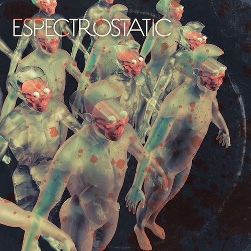
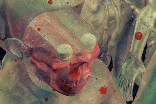
Alex Cuervo is a grafter in the punk rock tradition, having trod the boards across a number of punk bands; The Hex Dispensers, This Damn Town, Blacktop and Feast of Snakes. Espectrostatic is a solo venture that sees Alex pounding horror tunes out of synthesisers and drum machines, and this Espectrostatic debut long player is 13 tracks of sheer B-move soundtrack brilliance. Artist Jason Willis bedecked the album with a suitable army of doom, and provided Drowned in Sound with a slew of great influences and reference points for his beautiful madness.
DiS - This cover feels genuinely bizarre and macabre, what did you grow up on, artistically and how did you get into digital art?
Jason Willis - Medium-wise my art background is somewhat all over the place, and I really do like to try on lot of different hats. This might also just be a nice way of saying that I have a terribly short attention span. At various times I've focused on photography, painting, music making, filmmaking, writing, editing… so I suppose that doing digital work was one of those ‘bound to happen eventually’ type of deals, you know?
Also, like a lot of folks who end up being designers I was a music nut as a kid. Alongside a heavy diet of comic books, cereal boxes, movie posters and super cheap packaging, I totally loved album covers. I especially loved the stuff that seemed crude, weird or spooky, which I guess is still pretty much the case. I mean I genuinely do appreciate and respect invisible and, or, ‘perfect’ design, but I often just like it best when things look kinda’ jacked up.
Still I didn't really get going with actually making stuff myself until I was about 14. I used to publish a little punk rock fanzine from 1983-1987 and thanks to that I gradually fell into making flyers for local punk and hardcore gigs, trading my work for free admission to the shows. The results were pretty all over the place, but I was really attracted to the process and gradually developed a crude and cluttered visual sense that I think I'm largely stuck with.
Those flyers were a great training ground and they led me to doing other music related junk like album covers and t-shirts. Coupled with a few years of art school, this meant that when I eventually started playing in a few bands myself (the Weird Lovemakers, the Knockout Pills), I was usually the guy doing the bulk of the graphics. Lame or not it's hard to beat free, right?
So that's the basic story. Over the years I think my impulses and influences have probably largely stayed the same but I've gradually moved away from using nothing but hands-on techniques, such as cut and paste type collage and painting, towards incorporating programs like Photoshop and Cinema 4D into the mix. Now it's hard to imagine making something without them and I've adjusted my workflow accordingly.
DiS - So what brought you to the Espectrostatic project?
JW - It's funny, even though Alex Cuervo and I run in pretty similar circles… we're both punk rockerists with a lot of crossover when it comes to record labels, social groupings and mutual pals for example… and even though we share a slew of interests like B-movies and dime store design, our paths had never directly crossed until about a year ago when he hit me up on Facebook.
I think that he had stumbled across a few of my websites, either my thing (http:/www.jasonwillis.com) or maybe this Halloween record blog I used to do a while back called ‘Scar Stuff’. He also connected me to the Knockout Pills, while over on my end of things I had been a long time fan of Alex's musical work in the Hex Dispensers and was super stoked when I checked out some of his more ‘soundtrack’ audio under the Espectrostatic name. We talked about doing something together in the future, and a few months later when the deal was in place for him to put out a record with Trouble in Mind he asked if I might wanna’ try my hand at the cover art.
DiS – The image is fantastic, it feels like an image that the Residents, with their knowingly crude digital artwork, would put together. It exists beyond style, time or place more just a totally weird image. What was your thinking and approach to this image and what did you want it to reflect about the music?
JW - When it comes to genre and design, Alex really digs a lot of the same stuff that I do. This meant that there were a tonne of concepts and antecedents, Richard M. Powers, John Carpenter, being thrown around in our initial emails, but by the end we had boiled it down to, quoting Alex, "something late Seventies, early Eighties thematically anchored to a sort of occult science fiction vibe".
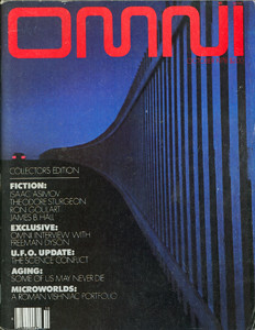
Using that phrase as a starting point I started to collect a bunch of visual inspiration while listening to the album itself. None of it was super specific, just images across all kinds of media that seemed to connect to the whole dark wave, Carpenter, Goblin and Tangerine Dream thing Alex was doing. I sketched up a few ideas, but eventually decided that I should be trying to somewhat approximate the surreal and creepy vibe embodied by the covers of Omni magazine during the late 1970's. Not a direct lift or anything, but hopefully something that felt like it maybe could exist in that universe.
And yeah, the Residents! I mean, even though it wasn't a conscious decision to reference their work I think it's pretty safe to say that, not unlike Devo, anyone with any kind of interest in the whole Seventies-Eighties weirdo futuristic nightmare landscape has to cop to having at least SOME Residents DNA in their visual arsenal, right? For sure their decision to embrace and amplify the crudeness of modern visual technology, and marrying it to their music, is something I absolutely get with.
DiS - Similarly the video you’ve created for the track ‘Consulting the Necronauts’ is great, really intense. Does the notion of intensity have any role in this work?
JW - Why thank you, sir!
In retrospect I guess that the textural, atmospheric and languidly paced, at least in comparison to some of the more driving and propulsive tunes on the LP, ‘Consulting the Necronauts’ might not be an obvious representative album track, but the more I played it, the more I thought that it could lend itself nicely to a somewhat single-minded or one-take type video. You know, the kind of thing you might have seen buried within an episode of the early 1980's TV show Night Flight, maybe around two AM. There's a slow burn to that tune that just builds and builds, and I think it makes the chord changes feel pretty grand when they kick in.
Technically speaking the cool thing about designing the cover in 3D was that I already had the elements fully developed from all potential visual angles and as a result those elements could easily be dropped into a video later and manipulated in a variety of ways. In this case that meant moving the camera around the existing figures, timing that motion out, and then applying the secondary elements and effects after the fact. Here's how that went: I used Cinema 4D to kick out all of the frames involving the figures, the Necronauts, and then I used After Effects and Final Cut Pro to create and edit in the rest. Here I'm talking about things like the TV static environment, the tunnel, the video distortion on the figures, masking off the blood spatters.
As an aside, the idea for the tunnel effect came from an earlier motion test I had worked up, using a much more 1960's influenced Espectrostatic logo, based on some hand lettered sci-fi pulp paperback designs. So I was happy to be able to give it a home.
DiS – Also, what role does horror play in your work, be it this piece or your work in general? The music is industrial in some respects, mechanical, for me, like a 'horror machine' and the ‘Necronauts’ on the cover are an army of horror - can you tell me what you wanted to portray that was 'horrifying'?
JW - Yeah, for as long as I can recall horror and really pretty much all things spooky has played a ridiculously large role in my psyche. As a kid I was all about ghouls, monsters, witches, zombies and so forth. As an adult I have an office that is completely littered with monster masks, spook show paraphernalia and more Halloween records than I can possibly justify. It's pretty absurd.
Personally I find that I'm mostly drawn to stuff that feels more cartoony than grim however. I know it's a fine line of distinction, but in addition to the more traditional representations of the supernatural and the un-dead, this tends to mean something along the lines of early 80's slasher films: yes, late 90's torture porn: no. I generally find that for me these images have moved from a child's exploration of death and the unknown to a visual and thematic vocabulary that I generally find familiar and comfortable; ghosts… souls without bodies and zombies… bodies without souls.
Does that make sense? I mean obviously I recognise that we tend to culturally use these devices to deal with all kinds of things that might induce fear or confusion… sexuality, death, whatever, but there's also something pretty pleasingly dependable when genre plays by the rules. I mean, no matter how wigged out they might be around the edges, you tend to know what you're going to get from a 1950's horror comic book or an episode of Kolchak the Night Stalker, and I think that as people age the ‘fantastic’ often becomes a simple communicative shorthand that can quickly connect them to each other.
So there's THAT, but I also think you've nailed another key notion that I was hoping to play with here: a somewhat visually ‘automaton’ army of the un-dead. Hopefully this kinda’ underscores the intentionally robotic and pulsing thing that Alex is doing musically, like a nexus where ‘Sci-Fi’ and ‘spooky’ might meet? Heh, or whatever. I mean I guess I could have just said COOL LOOKING, right? Because I was also totally going for that.
COOL LOOKING!
DiS – So how does the image together?
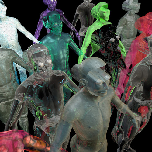
JW – Lemme’ see… the bulk of the work was done in Cinema 4D, which is a 3D modelling and animation application, with a pretty user-friendly point of entry. I've only been playing around with it for a year or so myself, and that's where I created the main "Necronaut" figures. I used a few existing models as the base for my design, then I went about pushing, pulling, deleting and generally modifying the various polygons and shapes until I thought they looked cool.
After the basic humanoid template was in place I cloned the figure several times, and then created and applied ‘textures’ which define elements like transparency, colour, reflection, refraction and so forth, to the models. This is the point in the workflow where I think that things really start to visually gel, once the models and textures are happening you can set up your camera position along with the kind of lighting that you want, and then render out images that look pretty slick despite how rough the layout or concept might actually be. I kicked out a few garbage renders with a bunch of texture options applied, then picked my favourites and applied them to the initial rough that I showed to Alex.
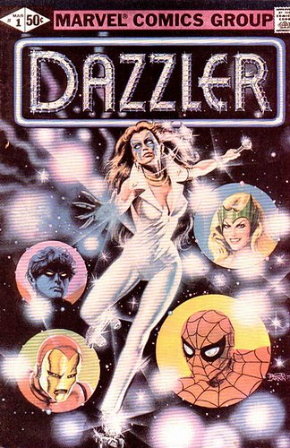
Even though design-wise the final is fairly close to this rough in several respects, both of us agreed that the vibe here ultimately missed the mark when it came to complimenting the music. The logo for ‘Espectrostatic’ tilts too far into electro territory. I was kinda’ going for a vaguely Saturn 3 thing. But I think it ended up feeling more like a rejected header for the Marvel Comics disco super hero Dazzler, the humanoids weren't creepy enough, there wasn't a real occult thing going on. You get the idea.
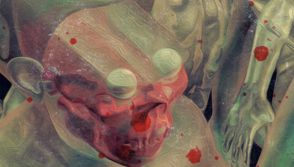
Still it seemed like a decent starting place, so I went back and retooled a number of elements. I added the skulls, because duh… skulls, and tweaked the figures a bit more. Next up was a retexturing of the models, then solidifying the camera position so that I could produce an initial base render. Once I had a nice 300 dpi version in hand, I took the image into Lightroom and played with the colour settings pretty heavily. Lightroom has a lot of really nice and highly precise options when it comes to colour correction and I love working with the tools there. Then it was over to Photoshop where I added the blood spatters and LP ring wear layers and applied a number of filters to the main image that were intended to take the smooth 3D forms and make them more ‘painterly’. I’ve a few detail shots that show the difference between the clean 3D that Cinema 4D produced and the final cover version.
After that it was really just a matter of adding the logo typeface, and handily enough Alex had a really cool one on hand that he had already made. Even easier was the back cover. All I really had to do was go to the original scene in Cinema 4D, and rotate the camera around towards the back of the figures. Then I followed the same basic workflow as the front: render a base image out, colour correct it in Lightroom, apply all of the painterly filters and then finalize the layout; text, ring wear, blood spatters in Photoshop.
‘Espectrostatic’ is available on CD and vinyl from Trouble In Mind Records: US + UK
Sharon Jones & The Dap Kings, ‘Give The People What They Want’ (Daptone)
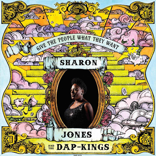
Sharon Jones is a legend and her latest album is another slab of powerful, heart-felt soul. After a period of illness it is of great comfort to have ‘Give The People What They Want’ released, and it was a pleasure to have Fritz Aragon, the artist behind the psychedelic cartoon cover, answer some questions for us.
DiS – This is a fantastic image, hold, bright and beautiful. And feels very much like an image for a Daptone release, had you worked with Daptone before?
FA - Gabe (Gabriel Roth, co-founder of Daptone Records) asked if I could sketch out some concepts he'd been playing with. I've done a pastel drawing of Sharon Jones before and some pen and ink work that was supposed to be used for a Charles Bradley record slip mat so, yes, I was already familiar with the Daptone touch. Gabe showed me some illustrations and elements from album art that he liked, one of them being the Chilites record, ‘Give More Power To The People’ which has a lot of discernible influences for the illustration. Gabe thought my style was relevant for what he was trying to convey. A hand full of flying pigs and a thousand dots later "Give The People What They Want" was conceived.
DiS – And have you always been an artist?
Fritz Aragon - I've been fascinated with art since I was old enough to pick up a pencil. It’s a natural way of expression and communication that still stimulates me the same way it did when I was a four-year-old. There wasn't ever one single thing that set me on course really, I was always receptive to whatever was in front of me at the time. I think I probably fell in love with art the same way a lot of people from my generation did. Cartoons, graffiti, skateboards, record covers. I feel I'm lucky to never grow out of such things. It's just an instinctive gravitation to what I do now, but I'm still not quite sure what that is. I guess that's a good indicator that I am on course.
DiS - What is the broader idea behind this cover, with Sharon's portrait at the front of this scene and especially with the flying piggy banks. Is this image a reflection of the music or more a visual statement in it's own right?
FA - I think that musically this album has some fantastic elements, bordering on psychedelic. Originally, the title track was going to be ‘People Don't Get What They Deserve’, so the idea of the American Dream being a sort of pyramid scheme with the riches coming ‘when pigs fly’ was definitely part of the concept from the onset. The cover draws from that duality of fantastic realism. We were trying to create a whole world for the record to exist in.
DiS – With this illusive, American Dream notion, is this therefore a protest album and image?
FA - I feel that it is. Protest art and music to me isn't always blatant and never has to be. I think that the flying/broken piggy banks, cash, and a pyramid-like step structure are pretty pronounced images. Here in America the rush to the top is what we get shoved down our throats all day long. And it isn't always blatant. I think the harmony of image, colour, and portrait of Sharon, who is obviously a beautiful and strong woman, give good balance to the overall illustration and music.
DiS - The style of the images also remind me of the Terry Gilliam, what are the visual influences to this work and again, what connects your visual influences to Sharon's music?
FA - Yes, it is definitely in the spirit of Terry Gilliam. Gabe actually wanted to have a Monty Python feel to the cover and I'm happy I could help convey that to the UK. I love putting energy in my art in one way or another. Sharon Jones is FULL of energy and so it was easy for me to...be myself.
DiS - What is the process in putting together an image like this and how long does it take?
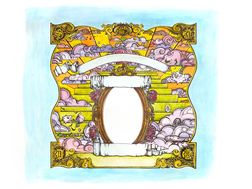
FA - From concept to completion I think it was about three to four weeks. I believe I made two to three drafts of pigs, banners, and steps before inking and one draft of watercolours. This process was more of a collaboration for me than anything. I'm used to doing punk rock record covers and fliers on my own terms so this kind of project was really exciting for me to take on. I think Gabe brought a lot of things out of me that I wouldn't necessarily try on my own but was glad that I did after. I mean, this is the first watercolour piece I've ever done and I work at an art store. I like to fill up space and use energy with bold lines and shading. And dots. Lots of dots. I call it "frixelation". The majority of the time was spent on concept and placement. Once that was created everything else seemed to magically fall into place.
‘Give The People What They Want’ is available on CD, limited edition vinyl and digitally from January on Daptone Records, pre-order here
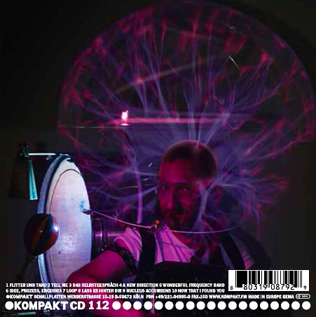
Justus Köhncke, ‘Justus Köhncke & The Wonderful Frequency Band’ (Kompakt)
Justus is probably the finest combiner of techno, electro and disco on the earth, and he rightly houses his music on the innovative Kompakt label. His latest release is a wonderful, symphonic through the dance music of the past and into the future. The art director for the album, Christian Kuepker, answered our questions on Justus’s latest opus.
DiS - Could you tell me briefly about your background and how you came to be involved in this image as the art director?
Christian Kuepker – I’m onvolved because Justus liked the flyers I did for our Pet Shop Bears party at Berghain and Kantine, Germany, where Justus DJs quite regularly, I guess. But we worked together before in my previous job for the "Sound/Silence-issue" of an art and fashion-magazine, where we recorded the sounds of a fashion shoot and he built a track from it. The photographer Attila Hartwig has also been a long time collaborator of mine from my time at ‘sleek’ magazine.
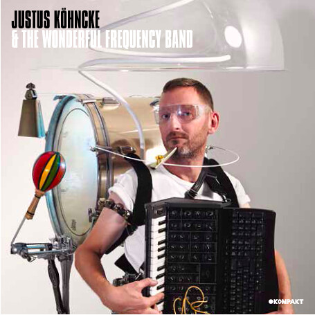
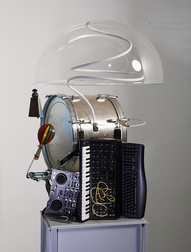
DiS - The idea of the one-man band, as highlighted by the photo is fantastic, with the album title too, what does this image tell us about the music it houses?
CK - We tried to visualize the virtual band that shrinking technologies put in your telephone and laptop in a very analogue way – even literally catching the electric vibes than run every wonderful thing.
DiS - The image also suggests a meeting between the future and traditional. Do you think that electronic music is now being accepted as a long established tradition that has a significant history? Where do you think Justus's music sits in this tradition and where does Kompakt sit in this tradition as one of the most famous electronic record labels of all time?
CK - When I was young there was a TV-Show called "Der Grosse Preis", where three experts sat in futuristic acrylic bubbles and battled each other with their own specialty knowledge. I see Justus sitting in the bubble as the ultimate disco expert!
DiS - How did you get the back image, with Justus apparently inside the large electric-glass globe? Was it dangerous?
CK - Thankfully Justus only has porcelain fillings, so that was no problem! He just had to take his metallic glasses off (the instruments were all earthed) to let the wonderful frequencies not kill him!
DiS - The front image is very striking, but at the same time I'm not sure why - what do you think it is about this photo that gives it it's impact?
CK - Actually we re-enacted a vintage stock photo of a one-man band which had the perfect angle.
DiS - The font adds to the futuristic feel - what is the font and how did you decide on the style of the graphics around the images?
CK - It's called Compacta Light – which made sense to me instantly from the label's point of view. The font actually is 2 years older than Justus himself.
‘Justus Köhncke & The Wonderful Frequency Band’ is available now on double LP, CD and digitally from Kompakt.
September Girls, ‘Cursing The Sea’ (Fortuna Pop)
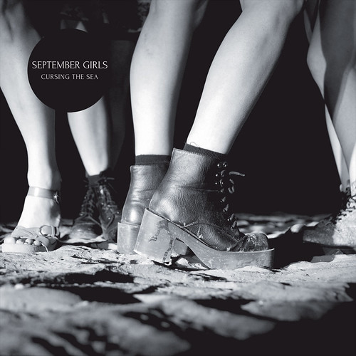
This debut from this Irish all-girl five piece is as beautiful as it is brash. Swimming in reverb and melancholy the ever-whimsical Fortuna Pop is the perfect home for such a graceful slab of noise. With an intriguingly cropped photo for a cover, DiS asked the photographer Jeannie O-Brien to tell us a little about the stories the image may, or may not, be housing.
DiS - What is your background, could you tell me a little on how you got into photography?
Jeannie O'Brien - My background in photography is centred mainly around the people I work with. My best work comes from collaboration. I did some work with The Warlords of Pez a while back and they had loads of great ideas and they did the all post-production for a cover we did for magazine Totally Dublin.
From this I went on to work with Mike Ahern (Pez member) on a few album covers, ‘Crayon Smith’ and ‘Jeff Martin’. From this went on to work with Mike and Karl Twomey to do a cover for one of my favourites for band, Halfset.
I guess the main thing I learned from these experiences was, work with good people and you will do good work. Simple. I never had a plan to do cover art, I just want to take pictures that the teenage me would put on her bedroom wall.
DiS - This cover, like other covers from the band's work seems to have a sense of homage to shoe-gaze and the 4AD aesthetic, a thoroughly beguiling abstract image that tells part of a story, but it's the rest of the unseen scene that really captures your interest. Can you explain what's going on in the image? Is it the band in the image?
JO’B - The band came to be with a very specific idea, they pretty much art directed the whole thing. I just wanted to get the ‘feeling’ with lighting and composition. I feel it’s more important what we didn’t show. I love doing press images for the band but we were all agreed the last thing the album cover needed was a cool group photo.
Yes it’s the band. Just me and the band on a beach in North Dublin. I guess we just wanted to have something going on and just capture a bit of it.
DiS - Would you say the shoegaze or 4AD influences are aesthetic styles you've inflected into the cover?
JO’B - I had to Google what shoegaze was, so I’m not familiar with that. My influences would be Corine Day and how unguarded her photos are, Eugene Richards for how he just gets a situation without having to show you everything and Mary Ellen Mark because her skill in photographing people makes me ill with respect.
DiS – What is the story behind this project from your perspective?
JO’B - Well I’ve worked with Paula and Caoimhe for years with their different bands. But up until this point we had never tried to do something a little more abstract and that was less about the image of the band. When they came to me first about doing the cover, I spent ages looking at photos on their Facebook and Instagram. Looking at these gave me a good idea of what they liked and what they were about, I think Instagram and the whole nature of the app has really influenced my work recently. I just want to snoop around and look at cool people and the cool things they like. And I wanted that to show through. They had a plan and I knew what they liked.
DiS - There's obviously a girl-group narrative to this story, but for me this is a real punk band, be it the Jesus and Mary Change British, lazy punk, or the scuzz of US hardcore distilled down into a background fuzz which creates a layer of harmony. Do you think there's any punk rock in this album and accordingly this image?
JO’B - Yes. And very much in how they work. I’m not punk rock but I get it and see it up close when I’m working with the girls.
DiS - Whilst there's lots of intrigue in this image, you don't get a sense that this is a personal image that necessarily wants to bring you into the world created, it almost feels as though it's warning you about the contents of the album. Do you think this is an image that wants to be directly engaged with or more to make a statement about the band?
JO’B - From my point of view, it’s a glimpse of something going on. It’s not an invite or a warning, just something you weren’t there for but the image fills you in on what you might have missed. I wanted the image to create more of a feeling, a smell even, like the smell on your jacket after a night out.
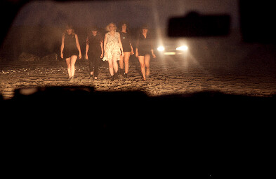
I love the image of the band shot through the window of the car. Again this was very much the band’s idea. I like to listen to all ideas but if I don’t like them I don’t do them. I need to put my name to what I like. Nothing less
DiS – So how did you come up with the cover shot?
JO’B - Okay so me and the five girls got in two cars and hit a very sandy beach in North Dublin late one summers evening. It all sounds very romantic because for me it was. The sun took ages to go down and I think all the hanging around was a good build up to shot being taken. Just talking shite and hanging out
We used the car lights to light the shot, something I’m a bit obsessed with and had wanted to do for ages. I really wanted this ‘no posh lights’ feel to it. It took all in all five or six hours, I shot it on digital, I love film but am still afraid of it. After it got dark we were joined on the beach by a bunch of boy racers, there was a feeling like something might happen and being that my camera is worth a lot to me, we packed up to leave. Both cars got stuck in the sand and the fellas were hollering and shouting over and I just thought, ah here we go…...but no, they were just offering to give us a push. Man we were wrong about those guys!
‘Cursing The Sea’ is out on CD in December on Fortuna Pop
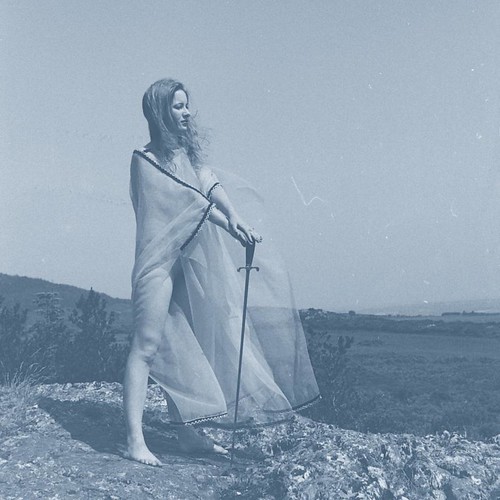
Unknown Mortal Orchestra, 'Blue EP' (Jagjaguwar)
Unknown Mortal Orchestra more commonly pump out funk-rhythms and garage pop, but for the Blue Record, on limited edition vinyl, acoustic renditions from their long player, ‘II’ are captured. Like ‘II’, white witch Janet Farrar stands proud in a beautiful blue wash. With an EP that opens up a whole new, tender, side to front man Ruban Nielson’s performances, we asked him a few questions on his ongoing love affair with witches.
DiS – It would be great to know more about the background on the image, and your interest in Witches.
Ruban Nielson - Witches are really interesting. The idea of a witch being a person, a woman usually, who summons or represents power in nature. Who is feared and reviled by straight, patriarchal, society. Rebels are usually depicted as male but it makes more sense to depict a rebel as a woman or a girl. The images of Janet Farrar used on two of the records capture all of those ideas for me. The idea of witchcraft is this ancient thing but I think it's useful for us today. I want my music to be like that: of this time and relevant but also out of step as well.
DiS – So is the artwork, and the music of the EP, an homage to the past, presented with a modern perspective, or are the other motivations behind the EP?
RN - I guess the idea of 'respecting the past' feels a bit boring. I'm not really that interested in the past in general, but I also think it's boring to try and be contemporary for no reason I suppose. The EP is mostly about songs and straightforward performance. Just removing the computer from the process to get something simple. The idea of the cover was pretty simple really, the sword, which was raised on the cover of ‘II’ is pointed downward at the ground, and the blue colour is cold. The symbolism is more reflective I guess.
DiS - What is it about the story of the Janet Farrar that’s enraptured you?
RN - It was just the image itself that got me at first. It was only after we contacted Janet through her book 'A Witches Bible' that I discovered more about her. That she was the high priestess of a coven based in Ireland and had married two husbands. Later she told me she loved the album and said that before she was a witch she had worked for the Beatles in London. Really strange how these things work out.
DiS – It’s interesting to see an image of a witch with a sword, that’s not a normal, stereotypical image.
RN - I think that the point is that the idea of a 'white witch' is a bit flawed. As if a witch is evil by default and this prefix let’s us all know it's going to be ok, or something. I think the language we use when we talk about women is like this in general. It's screwed up. Why can't she have a sword? We have so many images of men with weapons in popular culture and nobody questions it.
DiS – Again, witches, of the fairytale kind, aren’t often semi-clad, modern entertainers in music often are though. Is there any particular point to the fact that she's barely clad, for you?
RN - I think that's kind of part of what's interesting about the image. The photo was taken by her late husband, so it is very intimate. I'm not sure if it's controversial at all. I've never met anyone that didn't think it was a beautiful picture.
DiS - And why the blue rinse and name to the EP?
RN - It's in contrast to the album. I wanted something simple.
DiS - What was the process in obtaining the rights to use an image of this kind?
RN - A friend of mine found a similar image in a book called 'A Witches Bible'. After going through the process of getting in touch with the author of the book we discovered that she was the same woman in the picture, Janet Farrar obviously, and she had a series of photographs from that day. She was happy to let us use the images and we dealt directly with her rather than with the publishers of 'A Witches Bible', because we used different photos. She heard the album and said she really liked it, which was great news too. It would have been terrible if she'd hated it.
‘Blue Record’ is out now on vinyl on Jagjaguwar

