If you believe what football managers and club accountants tell you, fans these days care little for the FA Cup. League position, it seems, is all. Conversely, a heart-stopping cup run is seen as a distraction - a pointless pursuit of a tawdry bauble which could cost you safe mid-table mediocrity.
By the same token, in this debased digital age, the same vinegary churls see sleeve art as an anachronism. But the squares and money men are wrong about the untarnished glory of the cup. And they’re wrong about sleeves, too. Romantics know that sleeve art matters. And they don’t come much more romantic than Saint Etienne.
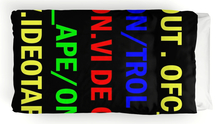
Taking their name from flash-but-faded French football team, Pete, Bob and Sarah's approach to their records is characterised by punk sage John Savage as a gesamtkunstewerk – a total artwork. That means that fans have been treated to sleeve art from Brit art luminary Julian Opie and photographer Martin Parr, plus the Subbuteo figure that comes with this month’s reissue of debut album Foxbase Alpha. And then there’s the sleevenotes – with original essays from Douglas Coupland, Turner Prize winner Jeremy Deller and Simon Reynolds, Saint Etienne’s covers are cover art for art’s sake.
DiS caught up with Bob Stanley of the band to talk about the importance of good record sleeves and playing sommelier to novelist Douglas Coupland.
DiS: People really responded to the effort that’s been put into the packaging of the Foxbase Alpha reissue. Do you think that’s evidence that people crave more than a digital file?
BS: Definitely. I’m not the first person to say this, but buying a download is like buying air. I think if you’re going to buy a piece of music you want something to go with it, you want an object.
DiS: What makes a good record sleeve?
BS: I think sleeves are a bit like band names. If you can make the two marry and reflect the music then that’s fine. Unknown Pleasures is a very good marriage. It looks like nothing you’ve ever seen and it sounds like nothing you’ve ever heard. And it’s quite blank and monochrome. I don’t know what the band thought of it at the time. I can imagine they thought it was a bit too arty.
A bad example would be Pet Sounds, maybe. The font is lovely but the photo is ridiculous. There’s a really mad-looking goat being fed by Mike Love and the Beach Boys wearing thick winter clothes, which isn’t what you think of when you think of the Beach Boys.
DiS: What drew you to Julian Opie’s landscapes for Sound of Water?
BS: He actually asked if we’d like portraits. I like them, but I just think we wouldn’t be very recognisable. Blur, whose Julian Opie portraits came afterwards I hasten to add, are obviously a bit more recognisable. I also thought that it wouldn’t suit the record. He was working on these landscapes, which all had a horizon right across the middle. They worked really nicely as a set and I thought that they really suited the music.
DiS: What inspired you to get Jeremy Deller and Douglas Coupland to do sleevenotes?
BS: With Jeremy Deller, we went to see the Turner Prize and I thought ‘hang on a minute there’s a lot of things here that are connected to what we’re into’. Apart from his love of World of Twist and Earl Brutus, he also grew up and went to public school in South London, the same as me and Pete.
So we asked him because we thought he’d be somebody who’d be into a similar aesthetic. I loved his sleevenotes. He was very nervous about writing them because he said ‘Well I’m not really a writer’. But I knew he’d get it.
DiS: Do you meet contributors before you work with them?
BS: Pete and Sarah met Douglas Coupland when they were touring America. They went to his house which is some outrageous 1960s place and he asked Pete to be his sommelier. But Pete didn’t know what a sommelier was. That’s the difference between our world and Douglas Coupland’s. He assumed we’d know what it was.
I love the slight diversion between what our real lives are like and what people think they are. Like we’re always jetting around the world with Salman Rushdie. We’re not quite like that.
DiS: I find that good sleevenotes and cover art provide a kind of alternative education that school just can’t. Did you get the same sort of thing when you were growing up?
BS: Yes totally. It’s the same with reading interviews with people that you like and they reference art and literature that you don’t know about when you’re 16. The Teardrop Explodes’ sleevenotes – I think Mick Houghton wrote them - are like that.
DiS: Do you think people get that from your sleeves?
BS: That’s what we are aiming for. When we did the baseball cards in Foxbase Alpha, even though there were obviously a few in-jokes and red herrings, it was essentially us saying these are people we commend and we think you should be discovering them.
DiS: Are you surprised that more bands insist on proper sleevenotes?
BS: I don’t know. It’s quite a personal thing, I suppose. Someone like Primal Scream I thought might have done it, since they’re people who are very into pop lore. Or the Pet Shop Boys, even.
DiS: Was there a sense that you were trying to revive a tradition that had fallen by the wayside?
BS: I wasn’t expecting anybody to follow our lead or anything, it was just that we thought it was an important thing to do. I can think of sleevenotes where when I think of the record or when I want to hear the record I think of the sleevenotes as well.
Even if they’re ludicrous, like Keith Altham’s for Scott 3. They’re unbelievably overblown but brilliant at the same time. I’m sure he cringes with embarrassment if he reads them now, but they add to the experience.


