Welcome to DiS is Ten's 'Artwork Day'. How are you? Well, I hope.
As the title suggests, there'll be some features on artwork: there'll be a good artwork top 10, and a bad artwork top 10. And then a couple of record label people are having their say, commenting about artwork in the past decade, as well as the future. And then lots of musicians will pick their favourite record sleeves. We are all going to have a lot of fun.
The past decade has seen the growing progression of mp3s, iPods, Spotify etc. Digital files on digital systems. Broadband killed the radio star. Physical record sales have declined, your music collection as permanent as a sandcastle, always at the whim of a finger of the delete key. Concurrent with that has been the decline of the album artwork, the physical package we hold in our hands while we give the record its first whirl. We don't read the lyrics sheet though, cos Jarvis told us not too.
Album covers have been reduced to tiny squares on a colour screen, the flood of digital blotting out the ink-on-cardboard beauty of before. Things are simpler, almost. Bands just need an image that looks good on a small screen. Artwork is dead.
Then again, there has been a reaction against this trend, as is always the case. Bands have started to innovate, to make physical albums more of keepsake, not something that you'll take to the record exchange when you need some cash. You have bands like of Montreal releasing an album on lamp format. You have Liars deluxe package of Sisterworld with its strange viewer. According to one contributor to the musician's favourite album sleeves, there's a record that folds up into a house. Labels like Constellation make a deal of having premium, high quality packaging. Claims of artwork's demise have been grossly exaggerated. And that's to ignore new trends, and the innovation that's possible with the digital age. How long before we have album covers that move, that contain GIFs or short videos?
Ultimately, artwork is always going to be needed, and necessary, as another component of the packaging of a band. Whether it's a photo of The Enemy looking tough in a grotty concrete council estate, or a high concept design of some sort of another by Liars, it's needed - even with record shops bleeding out on the high street - to have something that goes with your band, that says something about the group, what you stand for and what you're trying to do. It will always be important, and innovations should only make it more so over the coming years, whether that be in reacting against, or going with the digital grain.
The choice below represent my favourite artwork of the past decade. I will try to explain why, without resorting to "because it looks pretty" all the time. They are not in any order. Read on.
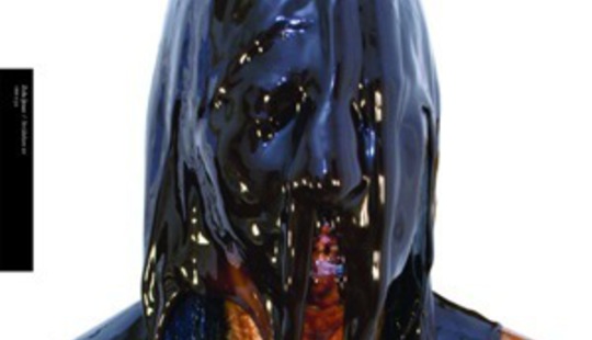
Zola Jesus - Stridulum EP
A simple idea, well executed (much like Yeah Yeah Yeah's recent egg crushing cover). Zola has a gallon of chocolate sauce poured over her head, but somehow it looks otherworldly, monstrous. The negative white background helps make it all the more stark. In an age where much artwork is 50 pixel squares, this stands out.
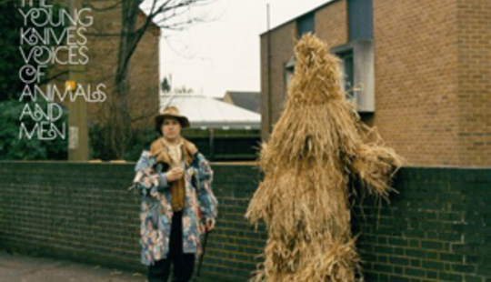
The Young Knives - Voices of Animals and Men
There's something about found images that always resonates with me, tiny pieces of social history like this, of some obscure English folk thing - the Whittlesey Straw Bear Festival. Given that the bassist was called the House of Lords (I can't be bothered to wikipedia as to why), they were clearly a band who liked to draw on that pastoral England thing. This image fitted what they were trying to do, while being bizarre enough to intrigue the mind. Why is something that looks like it should be in a straw covered field backed by modern buildings? Why is that man covered in straw? I do not know.
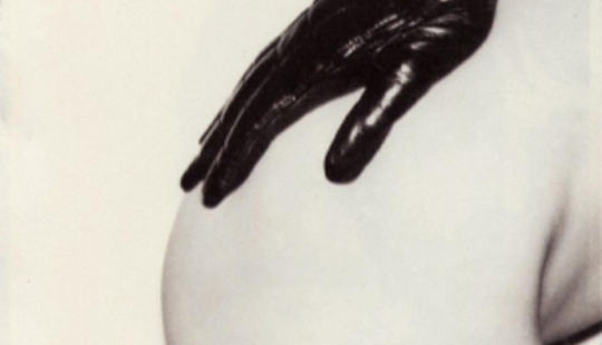
The Strokes - Is This It
Alright, I was 14 when this came out, and anything that featured a bit of pudenda was going to draw my eyes in, but Is This It is rather a grand sleeve. Simple, a bit kinky, black and white and soft tone. That could be used to say something about the band, but whatever. Like much of this top ten, it's a strong image. It's probably one of those album covers that'll be seen as 'iconic' for the whole decade, no doubt helped by the album being one of the most 'important' of the 00's. It's reminiscent of Helmut Newton's work...blah blah blah. I could go on, but I won't.
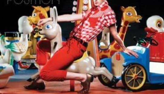
Patrick Wolf - The Magic Position
Wolf's music went all major key on this record, so as good as advertisement as any for that was the decision to have a technicolour fairground ride, Wolf sat astride a deer. It's a great example of the design representing the music. He's since gone back to the moodiness of Wind In The Wires, at least artwork-wise anyway, but for one brief moment, the glitter came out. It perks you up to look at it, doesn't it? Admit it; you love it.
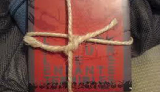
Hope of the States - L'Ark Pour Les Enfants Terrible
Hope of the States (one of the great forgotten bands of the noughties) worked for most of their career with type2error on their artwork, projections and videos. It created a unified image that worked magnificently. This limited edition EP was created from old tour flyers, folded up and tied with string. I could easily have given about eight other pieces of their stuff a place in this top 10 (heat reactive cover, hessian sleeve, the anatomy pictures inside The Lost Riots). A really tactile release, it was one way in which bands countered the rise of the digital age - by retreating to old fashioned design.
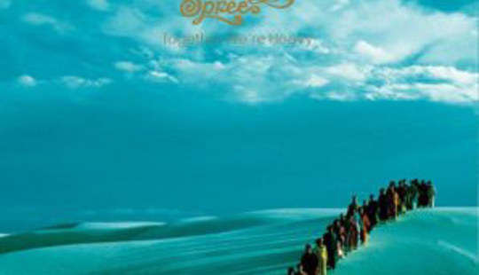
Polyphonic Spree - Together We're Heavy
Having as many members as the Polyphonic Spree do, there's a lot of creative possibilities for artwork. As such, Together We're Heavy represents the apotheosis of those options. The band stand far away, on a sand dune in coloured robes, with an over-saturated blue background. That's about it, but sometimes that's all you need.
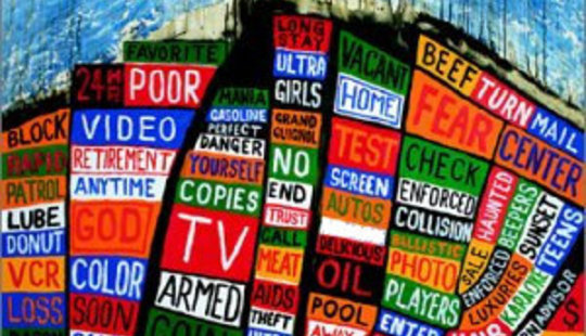
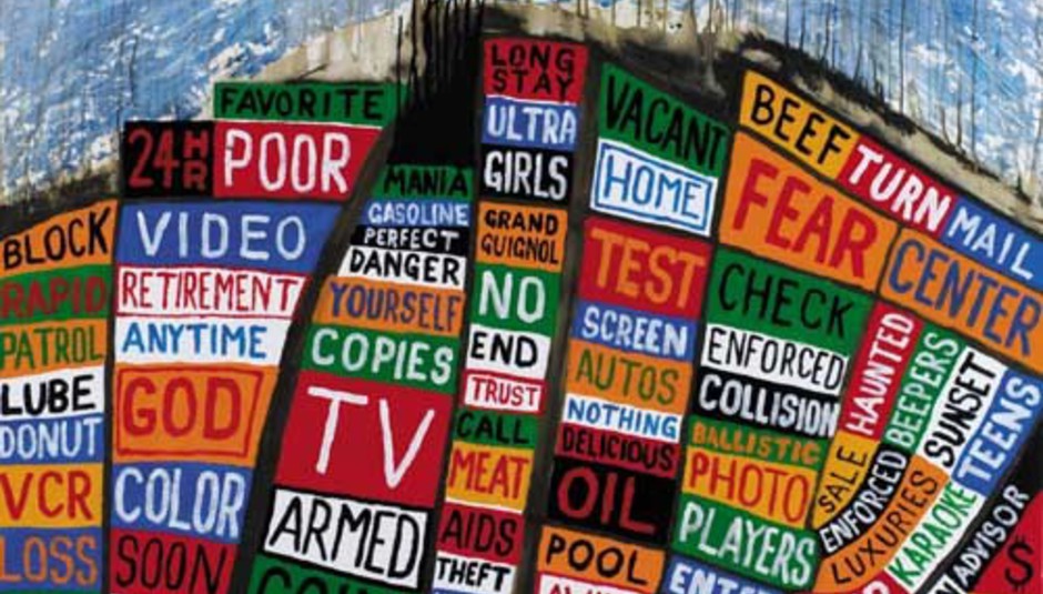
Radiohead - Hail to the Thief
It might all seem a bit "oh, I don't like that globalism malarkey" now, but it tapped right into a certain public mood of the time. That's kind of died away into cringing now, the anti-centralism fervour dulled into acceptance. Either way, these paintings, which reconstitute cities into blocks of buzzwords and concepts was political, intelligent and, ultimately, nice to look at. It is also good to have nostalgia for when we still had passion. Before we got eaten by the machine, man.
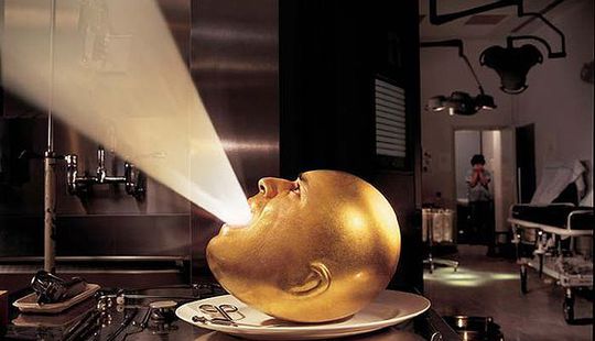
Mars Volta - De-loused in the Comatorium
Those high concept Storm Thorgerson covers can be pretty terrible (Audioslave, Muse etc), and a lot of people would argue that this is another in his line of tiresome duds. A decapitated golden head letting out a beam of light, while someone in the background holds their head in their hands. It's pretty meaningless. Then again, it's a wonderful piece of high design, and doesn't it just suit the bands ridiculousness perfectly?
Deerhunter - Microcastle
Nothing wrong with a bit of collage.
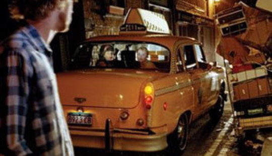
The Research - Breaking Up
It's a good band photo, with a narrative 'n all. Down a side street, the lead singer stands sullen, watching his female bandmates depart in a taxi. What does it mean? WHAT DOES IT MEAN? Has he been a drunken embarrassment again, and tried it on with one of them? Is he about to push that tottering luggage rack onto the car? Too many questions, too little time.
So those are my top 10 record covers of the past decade. But the question that is burning me up and plagues every one of my waking moments is - what are your favourite bits of album artwork for the ten years that DiS has been around? Please tell me below...


")

